
CareCru → Re-branding & Design System
Role: Senior Product
Designer
Focus: Scaling a healthcare SaaS through systematic design delivery
Timeline: 2022
Focus: Scaling a healthcare SaaS through systematic design delivery
Timeline: 2022
Context
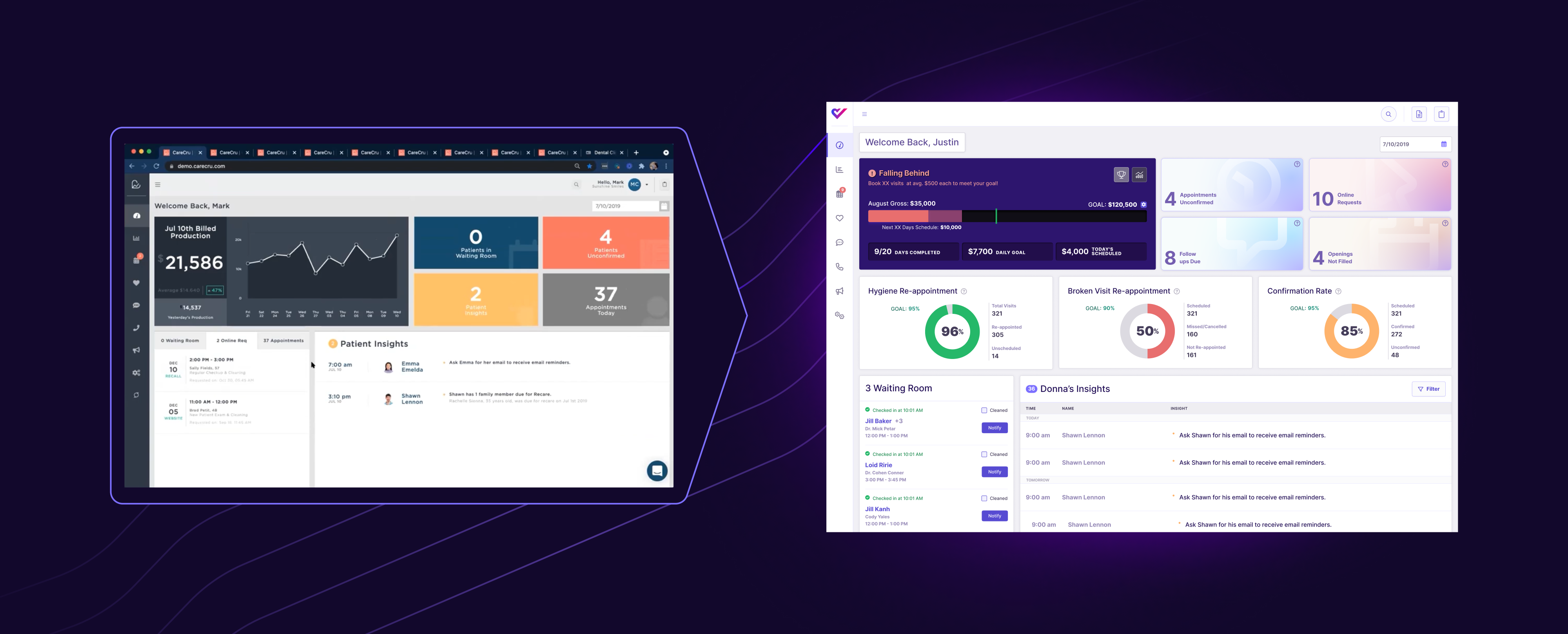
CareCru is a B2B
SaaS platform for dental practices. Its flagship
product, DonnaAI, automates scheduling, reminders, confirmations, recalls, and patient
communication.
The system was powerful, but complexity was leaking into the user experience.
New clinics struggled to onboard.
Existing users found key workflows hard to navigate.The website did not reflect the maturity of the product or convert efficiently.
The system was powerful, but complexity was leaking into the user experience.
New clinics struggled to onboard.
Existing users found key workflows hard to navigate.The website did not reflect the maturity of the product or convert efficiently.
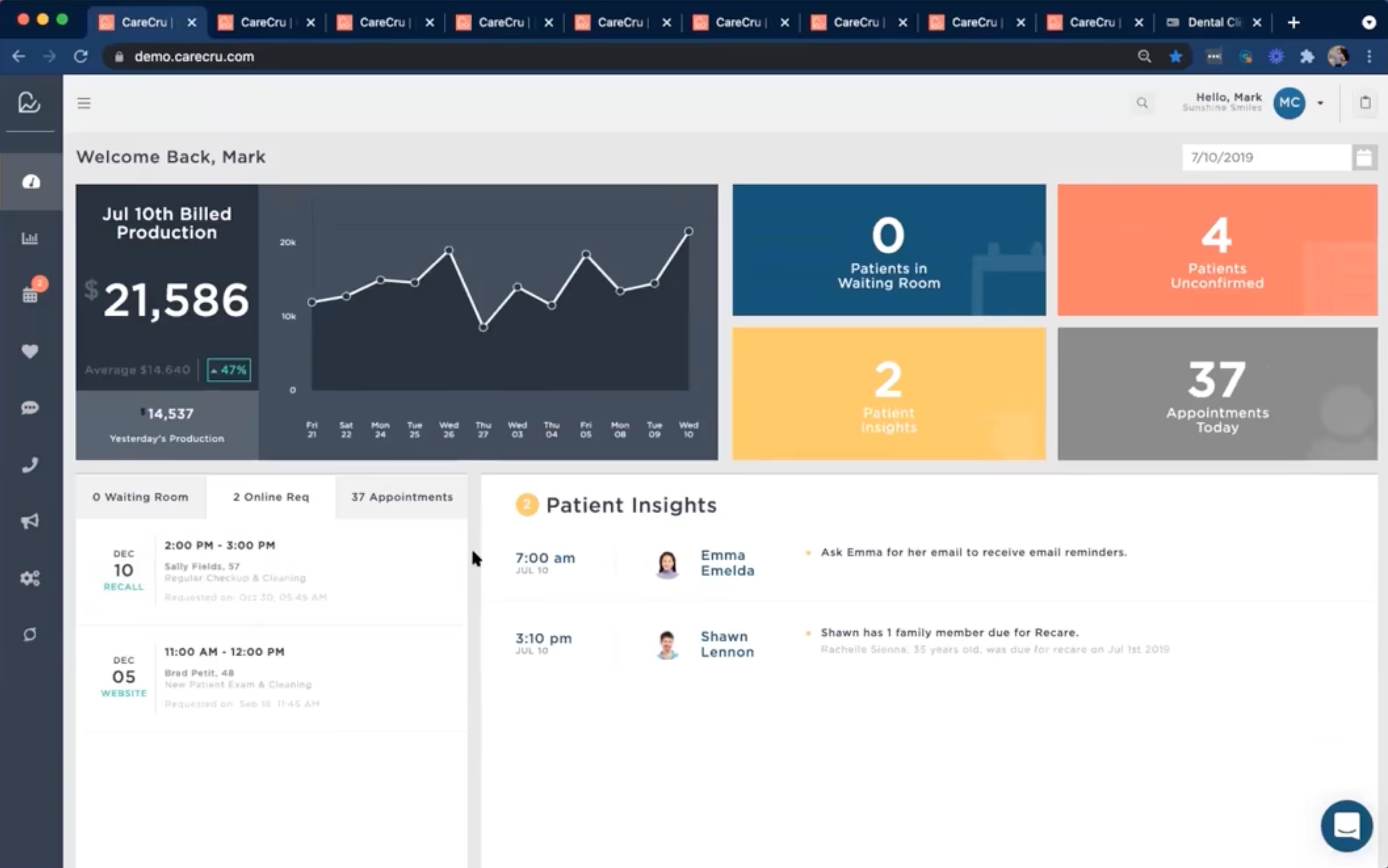
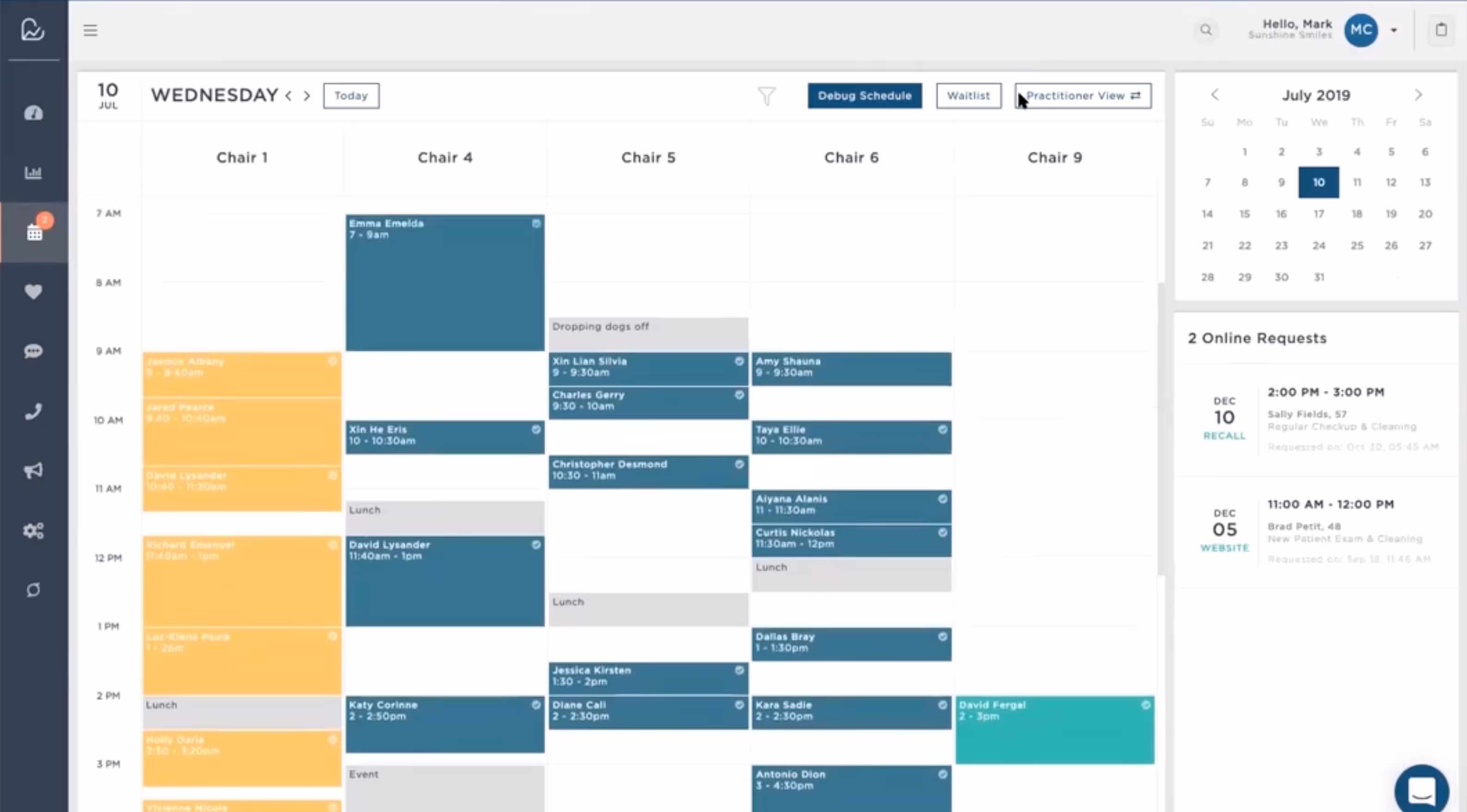
Problem
DonnaAI exposed too
much system complexity too early.Users were
asked to understand configuration, automation rules, and internal terminology before seeing
value. This resulted in:
• Low adoption of core
workflows
• Longer onboarding time for new clinics
• Confusion-driven support tickets
• A brand perception misaligned with enterprise customers (DSOs)
• Longer onboarding time for new clinics
• Confusion-driven support tickets
• A brand perception misaligned with enterprise customers (DSOs)
My Role
Product & UX
Designer: I owned UX optimization across core flows, implemented and maintained the
design system, led two rebranding initiatives, and designed and built the new marketing
website.
I worked closely with product, engineering, and customer success, using quantitative data and direct client feedback to guide decisions.
I worked closely with product, engineering, and customer success, using quantitative data and direct client feedback to guide decisions.
Approach
My goal was
not to remove complexity, but to move it out of
the way.
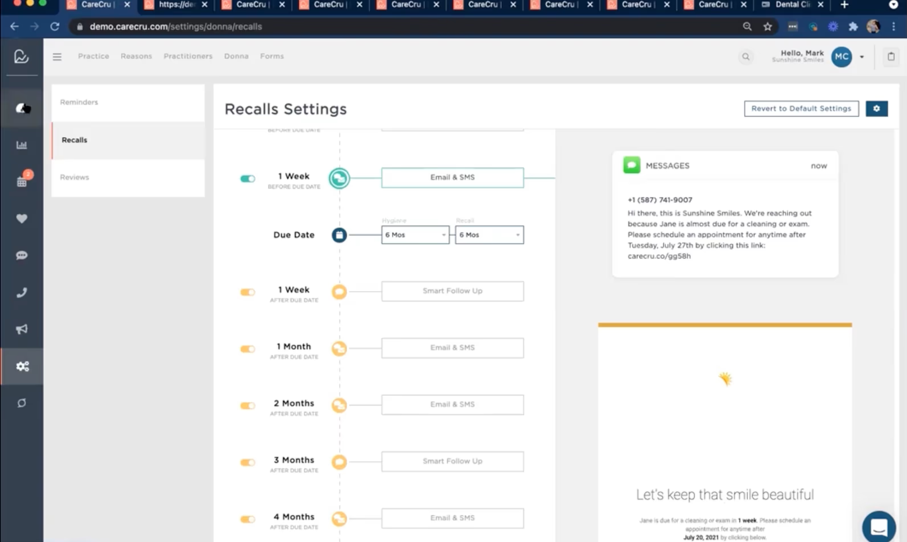
What I cut
• Secondary and edge-case controls from primary flows
• Redundant configuration screens
• Internal language that leaked into the UI
• Decisions that did not affect outcomes
What I fought to keep
• Automation logic and system flexibility
• Transparency into what the AI was doing
• Escape hatches for advanced users
• Real-time feedback so users trusted the system.
This resulted in fewer visible choices per step, clearer mental models, and a guided path to value.
Results
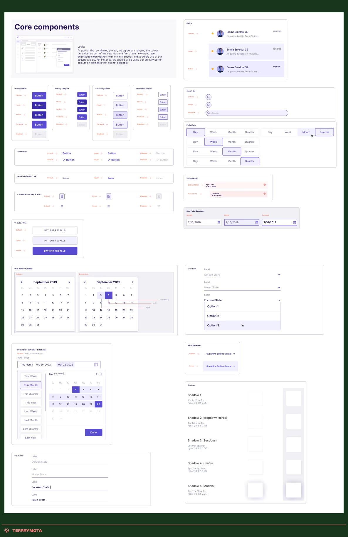
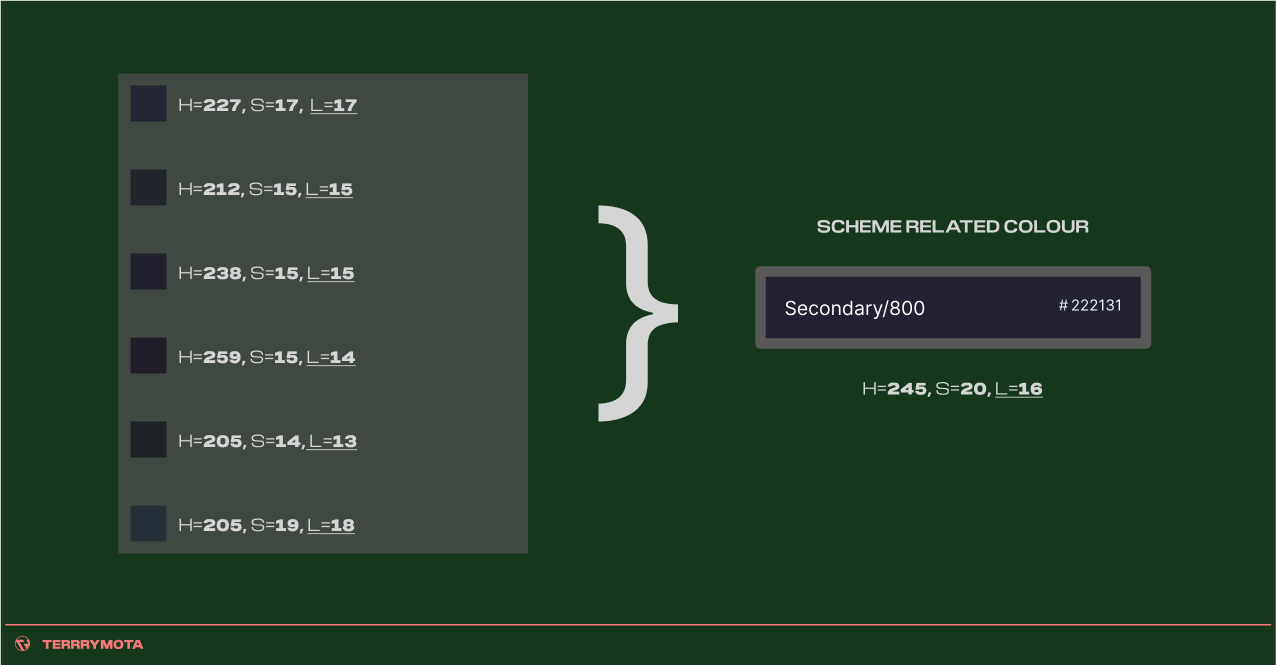
Design
System & Rebranding
To
support scale and consistency, I implemented a modular
design system in Figma aligned with product priorities.
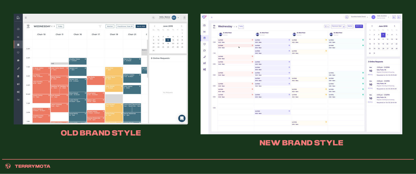
In parallel, I led two rebranding initiatives to align the product and marketing with enterprise expectations, including typography, color, tone, and component structure.
I also designed and developed the new website in Webflow to reflect product clarity and improve conversion.
In parallel, I led two rebranding initiatives to align the product and marketing with enterprise expectations, including typography, color, tone, and component structure.
I also designed and developed the new website in Webflow to reflect product clarity and improve conversion.